Finding the perfect color scheme for each room can be tough. Havenly designer Kelsey Fischer says, “The first step is picking a palette. It sets the mood for the space.” With so many choices, picking the right interior paint color schemes can feel overwhelming.
To simplify this, it’s key to check out the latest trends and expert tips. For example, you can find the top home interior color trends for 2025. This way, you can make your home look harmonious and beautiful.
Key Takeaways
- Understanding the importance of a cohesive color scheme
- Exploring the latest interior paint color schemes
- Getting inspiration from top home interior color trends
- Creating a harmonious atmosphere in your home
- Simplifying the process of selecting the right color combinations
The Basics of Color Theory in Home Design
Color theory is key to making our homes look great. It’s a set of rules for picking colors that work well together. This makes our living spaces more beautiful.
Understanding the Color Wheel
The color wheel is a basic tool in color theory. It helps designers pick colors that go well together. It’s a circle with colors arranged in a special way.
The color wheel shows primary colors (red, yellow, blue), secondary colors (orange, green, violet), and tertiary colors. Tertiary colors are made by mixing primary and secondary colors.
Knowing the color wheel helps us find colors that match. We can find colors that are opposite (complementary), next to each other (analogous), or equally spaced (triadic). This lets us create many color schemes.
Warm vs. Cool Colors
Colors can feel warm or cool. Warm colors like red, orange, and yellow make a room cozy. Cool colors like blue, green, and violet make a room calm.
Choosing colors wisely affects how a room feels. Warm colors can make a room lively, while cool colors can help it feel peaceful.
| Color Type | Examples | Effect |
|---|---|---|
| Warm Colors | Red, Orange, Yellow | Evokes warmth, stimulates conversation |
| Cool Colors | Blue, Green, Violet | Calming effect, promotes relaxation |
Neutral Tones and Their Importance
Neutral colors like beige, gray, and white are very important. They help balance colors in a room. They can also make bold colors stand out.
Neutral colors are great because they’re flexible. They help tie different parts of a room together.
Learning about color theory helps us create popular home color palettes. It lets us pick coordinating color schemes for home decor that show our style.
Popular Color Combinations for Living Rooms
Choosing the right colors for your living room is key. It’s where we relax and spend time with loved ones. So, picking colors that make it welcoming is crucial.
Using two or three colors together can really improve your living room’s look. Interior design says mixing colors well makes a space look great. Here are some top color combos for your living room.
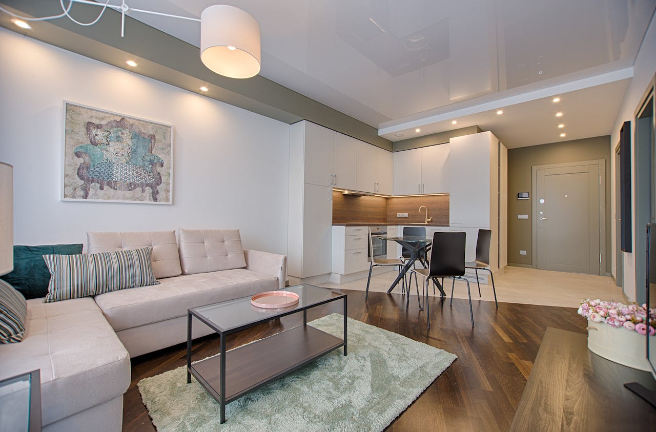
Sophisticated Gray and White Duo
A gray and white scheme is always in style for living rooms. It looks clean and sophisticated, fitting many decorating styles. Gray is a neutral base, and white adds brightness and elegance.
- Try different gray shades for depth and interest.
- Add white furniture and decor for more brightness.
- Use throw pillows and rugs with textures for coziness.
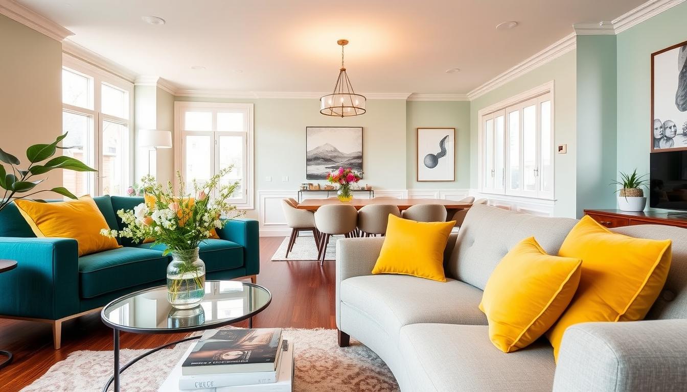
Bold Blue and Yellow Contrast
For a bold look, mix blue and yellow. This combo makes your room lively and energetic, great for a lively living room.
“The right color combination can transform a room from ordinary to extraordinary.”
Start with blue for walls and furniture. Then, add yellow with accessories like vases, pillows, or a big piece of art.
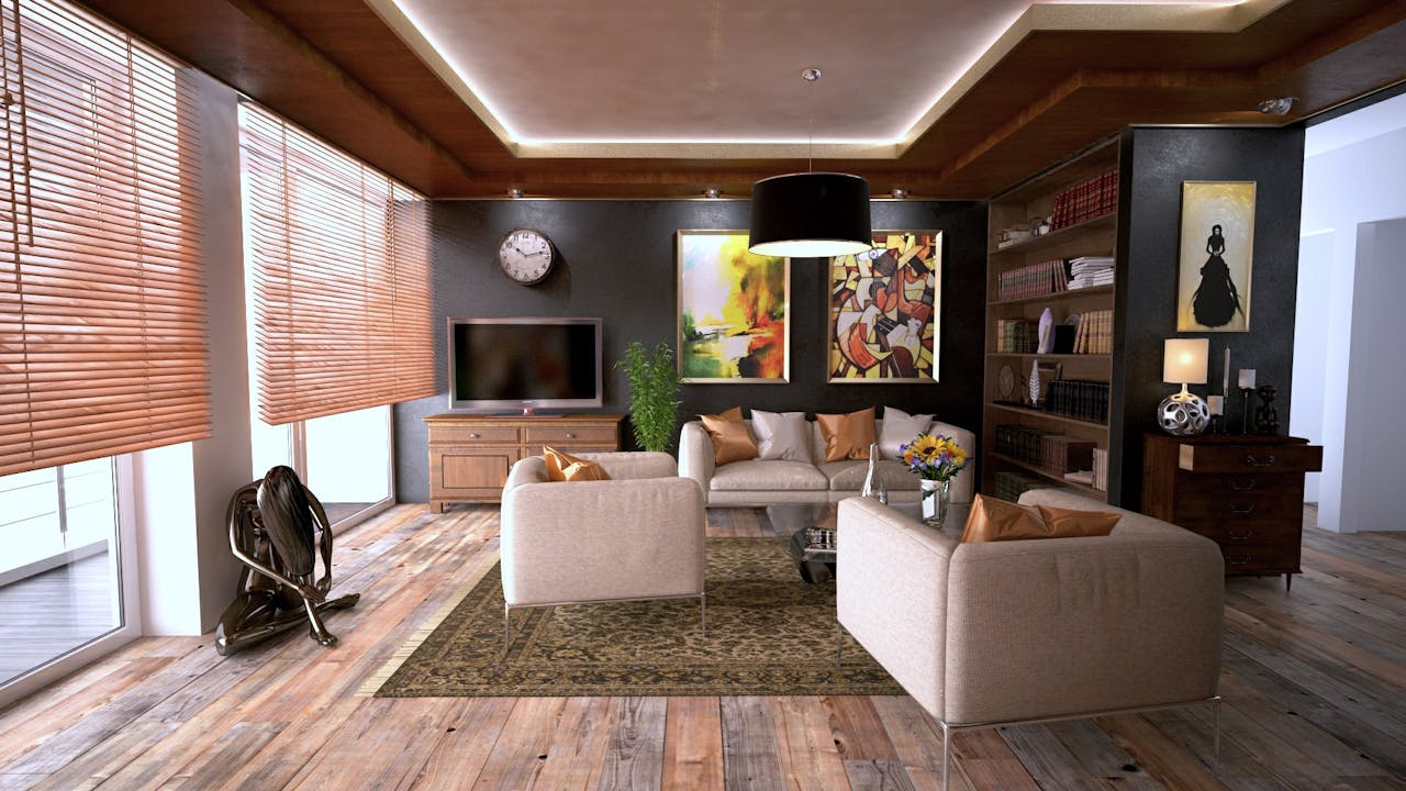
Earthy Tones for a Cozy Feel
Earthy colors like sienna, sage, and sand make your living room cozy. These natural hues add warmth and comfort, making it feel relaxing.
To get this cozy look, use earthy tones for walls, furniture, and decor. Add natural textures like wood and woven fibers to balance it out.
Exploring these color combos can help you find the perfect palette for your living room. Whether you like a gray and white duo, a bold blue and yellow mix, or earthy tones, the right colors can turn your space into a cozy haven.
Choosing the Right Palette for Bedrooms
Creating a serene bedroom environment starts with selecting the perfect color palette. The bedroom is a personal sanctuary where we rest and recharge. Its design is crucial for our well-being.
When choosing a bedroom color scheme, it’s essential to consider the mood and atmosphere we want to create. For a relaxing ambiance, soft, calming colors are often the best choice. According to interior design experts, understanding the psychology of colors can significantly impact our sleep and relaxation.
Calming Pastels for Serenity
Soft, sweet pastels are perfect for creating a serene atmosphere in bedrooms. Colors like pastel green, yellow, gray, and dusty lavender are timeless choices that promote relaxation. These gentle hues can make a bedroom feel like a tranquil retreat.
Rich Jewel Tones for Luxury
For those who prefer a more luxurious feel, rich jewel tones can add depth and sophistication to a bedroom. Colors such as emerald green, sapphire blue, and ruby red can create a dramatic and opulent atmosphere. When using bold colors, it’s essential to balance them with neutral accents to avoid overwhelming the space.
Monochromatic Schemes for Simplicity
Monochromatic color schemes involve using different shades of the same color. This approach can create a cohesive and harmonious look in the bedroom. For example, various shades of blue, from light sky blue to navy, can be used for walls, bedding, and decor to create a soothing and elegant space.
To help you decide, here’s a comparison of these three approaches:
| Color Scheme | Mood Created | Ideal For |
|---|---|---|
| Calming Pastels | Serene, Relaxing | Guest bedrooms, Kids’ rooms |
| Rich Jewel Tones | Luxurious, Dramatic | Master bedrooms, Luxury suites |
| Monochromatic Schemes | Simple, Cohesive | Any bedroom, for a harmonious look |
By considering the trending interior colors and modern interior color trends, we can make informed decisions about our bedroom’s color palette. Whether we opt for calming pastels, rich jewel tones, or monochromatic schemes, the key is to choose colors that reflect our personal style and promote relaxation.
Inspiring Ideas for Kitchen Interiors
The kitchen is the heart of the home. Its design should be warm and functional. A good color scheme can make the kitchen beautiful and inviting.
Classic Black and White Theme
A classic black and white theme is always in style. It gives a clean, sophisticated look. Plus, it’s easy to add color with accessories and decor.
Soft Greens and Creams for Freshness
Soft greens and creams make a kitchen feel fresh. They bring calm and serenity. Use soft greens for cabinets or backsplashes, and creams for countertops and walls.
Vibrant Reds for a Chef’s Vibe
Vibrant reds add energy to your kitchen. They make you hungry and create a lively vibe. Use red for appliances, cabinets, or a statement wall.
To help you visualize different kitchen color schemes, here’s a comparison table:
| Color Scheme | Description | Ideal For |
|---|---|---|
| Black and White | Classic, sophisticated, and clean | Modern kitchens |
| Soft Greens and Creams | Fresh, calming, and serene | Country or rustic kitchens |
| Vibrant Reds | Bold, energetic, and stimulating | Kitchens for avid cooks |
Choosing the right color scheme can make your kitchen beautiful and functional. Whether you like classic or vibrant, there’s a perfect color combination for you.
Color Combinations for Dining Areas
Choosing the right colors for your dining area is key to creating a warm welcome. This space is where we share meals and make memories. So, picking a color scheme that enhances the ambiance is important.
Let’s look at some amazing color combinations for your dining area. These can turn your space into a stylish and inviting place. Here are some of our top picks:
Elegant Navy and Gold Scheme
An elegant navy and gold scheme is great for a sophisticated dining area. The deep navy blue walls paired with gold accents add luxury and elegance. This combo looks stunning with white or light-colored furniture for a striking contrast.
Rustic Burnt Orange and Olive Green
For a cozy and rustic feel, try burnt orange and olive green. These earthy tones warm up the dining area and make it welcoming. You can use these colors for walls, furniture, or decor.
Bright Teal and Coral for a Fun Space
For a playful dining area, bright teal and coral are perfect. These vibrant colors make the space fun and energetic, great for casual dining and parties. Pair these bold colors with neutral furniture to keep the space balanced.
When picking a color scheme for your dining area, think about the style and vibe you want. Whether you like elegant and sophisticated or fun and vibrant, there’s a color scheme for you.
Here are some tips for choosing a color combination:
- Think about the natural light in your dining area and how it affects the colors.
- Consider the style and color of your furniture and decor.
- Don’t be afraid to try different shades and combinations.
- Use online tools or get advice from a designer if you’re unsure.
By picking the right color combination, you can make a dining area that’s not just beautiful but also reflects your style.
Creating Harmony in Open-Concept Spaces
Open-concept living spaces are popular, but making them harmonious is tricky. It’s key to pick a color scheme that links different parts of the home.
Using Shades of the Same Color
Using different shades of the same color is a smart way to make open-concept spaces feel connected. For example, using various blues from light to navy can tie everything together.
- Choose a color you love that fits your home’s style.
- Use lighter shades in open areas.
- Deeper shades work well in cozy spots.
The 60-30-10 Rule Explained
The 60-30-10 rule is a decorating tip for balance in open spaces. It says 60% of the area should be a main color, 30% a secondary, and 10% an accent.
Applying the 60-30-10 rule:
- Make 60% of the space a dominant color, like beige or gray.
- Use a secondary color that matches the main one for 30%.
- Add a pop of color with an accent for 10%.
Seamless Transitions Between Rooms
Smooth transitions between rooms are vital in open spaces. Using the same flooring and colors that complement each other helps a lot.
Tips for seamless transitions:
- Keep the color palette consistent.
- Choose furniture that fits the color scheme and style of nearby areas.
- Avoid sudden changes in flooring or color.

By using these tips, you can make your open-concept space look great and feel welcoming.
Accent Colors: How to Make a Statement
Making a statement in home decor often starts with the right accent colors. Accent colors add depth and personality to a room. They make it feel more inviting and unique. Used thoughtfully, they enhance the overall aesthetic, creating a harmonious and visually appealing environment.
Choosing Pops of Color
Choosing pops of color is a great way to add accent colors. You can use furniture, accessories, or artwork. For example, a neutral room can get a bold piece of furniture or a vibrant rug as a focal point. Explore whole house color schemes for inspiration.
- Start with a neutral base to allow your accent colors to stand out.
- Experiment with different hues to find the perfect complement to your existing decor.
- Use accent colors sparingly to avoid overwhelming the space.
Bold Artwork as a Focal Point
Bold artwork is a great way to introduce accent colors. A statement piece can instantly draw the eye and create drama. Choose artwork that complements your existing decor. A bold piece of art can be a great conversation starter and add sophistication to your home.
Pillows and Throws for Subtle Hits
Pillows and throws are a subtle way to add accent colors. They can be easily swapped out to update your decor. By choosing pillows and throws in trending interior colors, you can keep your space feeling fresh and current.
- Select pillows and throws in colors that complement your existing decor.
- Mix and match different textures and patterns to add depth to your space.
- Don’t be afraid to experiment with different colors and combinations.
By thoughtfully incorporating accent colors, you can create a space that feels personalized and reflects your style. Whether you’re looking for wall color ideas or wanting to stay on top of trending interior colors, using accent colors effectively can make all the difference in your home’s decor.
Seasonal Color Combinations to Refresh Your Home
Refreshing your home’s color scheme is easy with seasonal hues. This keeps your home looking modern and matches the natural feel of each season. Let’s look at how to update your home with the latest stylish colors.
Renewal with Spring Pastels
Spring is the perfect time for pastel colors. Soft pinks, baby blues, and mint greens bring renewal and freshness. They’re great for bedrooms and living areas, creating a calm and serene feel.
To add spring pastels, try throw pillows, blankets, or painting a wall. This subtle change can refresh your space without overwhelming it.
Vibrancy with Summer Brights
Summer calls for bright colors. Coral, turquoise, and sunny yellow add fun and energy. They’re perfect for kitchens and dining rooms.
For a bold look, use summer brights in furniture, curtains, or accessories. But remember, balance is key. Pair these colors with neutral tones to avoid overwhelming the space.
Warmth with Autumn Hues
Autumn brings warmth with earthy tones. Burnt orange, olive green, and terracotta create a cozy feel. They’re great for living rooms and dining areas, perfect for family gatherings.
To welcome autumn hues, add natural elements like wood and stone. Use warm-toned textiles and earthy ceramics. This creates a harmonious and inviting space.
| Season | Color Scheme | Ideal Rooms |
|---|---|---|
| Spring | Pastel pinks, blues, greens | Bedrooms, Living Areas |
| Summer | Corals, turquoises, yellows | Kitchens, Dining Rooms |
| Autumn | Burnt oranges, olive greens, terracottas | Living Rooms, Dining Areas |
Embracing seasonal colors keeps your home feeling fresh and in tune with the season. Whether you love spring pastels, summer brights, or autumn hues, there’s a color scheme for you.

Popular Color Trends of 2023
This year, we’re seeing a shift towards nature-inspired hues and bold statements in interior paint color schemes. Homeowners are looking to bring the outdoors in. They want to make a dramatic impact with their decorating choices.
Nature-Inspired Greens
Nature-inspired greens are a dominant trend in 2023. These earthy tones bring calm and serenity to living spaces. From soft sage to deep forest greens, there’s a shade for every style.
To incorporate this trend, pair green walls with natural wood accents and plenty of plants.
Bold, Dramatic Colors
For those who dare to be different, bold, dramatic colors are making a statement in 2023. Deep blues, rich reds, and vibrant yellows add personality to any room. When using bold colors, balance is key.
Pair a bold wall color with neutral furniture and decor to avoid overwhelming the space.
Soft Neutrals That Sooth
On the other end, soft neutrals are still popular for a soothing and timeless look. Shades like creamy whites, gentle beiges, and soft grays create a calming atmosphere. They provide a versatile backdrop for any decor style.
To give you a better idea of how these trends can be applied, here’s a comparison of the different color schemes:
| Color Trend | Description | Best Used In |
|---|---|---|
| Nature-Inspired Greens | Earthy tones that bring calm and serenity | Living rooms, bedrooms |
| Bold, Dramatic Colors | Deep, rich colors that make a statement | Accent walls, dining areas |
| Soft Neutrals | Timeless, calming shades | Bedrooms, kitchens |
By understanding and incorporating these popular color trends of 2023, you can refresh your home’s decor. You can create a space that feels both current and personal.
Tips for Testing Color Combinations
Testing color combinations is key in home design. It can make or break your space’s feel. It’s not just about picking colors you like. It’s about finding a palette that looks good together.
Understanding color theory and trends is important. But, testing these colors is what really matters. It ensures they work well in your home.
Sample Swatches in Different Light
Testing colors in different lights is a great way to start. Natural, artificial, and day time light can change how colors look. Painting small swatches on different walls or using samples helps a lot.
For example, a color might look great in morning light but not at night. This shows how important it is to test in various lights.
Visualizing with Digital Tools
Today, technology helps a lot with color testing. Online tools and apps let you visualize color schemes on your walls virtually. You can upload a room photo and try out different colors.
This is fun and saves time and money. For more color ideas, check out our article on the best color palettes for homes.
Asking for Professional Opinions
Getting outside help is also valuable. Don’t be shy to ask interior designers or color consultants for their thoughts. They can offer insights and help you choose colors wisely.
Professionals can see things you might miss. They know the latest trends and can suggest colors that fit your style. Remember, a fresh perspective can change everything.
In conclusion, testing colors is essential. By trying swatches, using digital tools, and getting professional advice, you can pick the right colors. The best colors for your home should match your style and look good together.
Final Thoughts on Color Combinations
Color is key in making our homes look great. The right colors can make us feel better and bring harmony to our spaces.
Impact on Mood
Colors can really change how we feel in a room. Soft greens and pastels help us relax. On the other hand, bold colors can make a room lively.
Personalizing Your Space
Choosing colors for your home should reflect your taste. Pick colors that show who you are. This way, your home will feel like it’s truly yours.
Embracing Change
Don’t hesitate to try new color combinations. Changing up your colors can make your home look fresh and modern. It’s a great way to keep your space feeling new.